So, you’ve chosen the style of your next planter, but you’re not sure what color the planter should be? Picking that perfect planter color can certainly be tricky as there are many things you need to factor into your decision. For starters, will the new color mesh nicely with all the colors around it, and how will it affect the people interacting with the space?
Don’t worry, we’ve got it all covered here. Here’s what it takes to make a conscious decision with respect to planter colors: the most popular colors and what they can add to an area, some of our favorite planter color combinations, key factors to consider when deciding on a color scheme – and much more!
A Few Starting Thoughts
If you have ever worked on a design project, you know that a paint swatch that seems the perfect shade in the store could look completely different in your space. Besides the fact that the light in your space could be different from the light in the store, any objects that aren’t neutral, including the furniture, curtains, and area rugs, may alter the way you perceive colors.
Place a red-colored fiberglass planter in a glossy finish next to a sofa that is the same tone of red, and the color of the planter might appear slightly lighter because of the glossy finish. The color of different decorative items in a space could be affected by the intensity and color of the light, and warm light can make yellow, orange, and red look brighter, while muting green and blue. Cool light, on the other hand, could enrich blue and green.
Don’t choose planters based solely on the colors, finishes, and textures displayed online, especially since the light in your space can also make them look very different. The best way to select the right planters for your design is to get a hefty supply of color swatches and put different samples next to the color on your screen. You have a match when the color swatch and the color on your screen blur together. Then, you can use the sample to see how the color looks in your space.
Most Popular Planter Colors
There are a few things you need to be aware of before you choose pick your planter color. For instance, the color of the planter could determine how much heat it retains – the darker the color, the more heat the planter retains, meaning that a lighter planter would often do better in hotter climates than darker planters. Keeping this in mind, here is a list of the most popular planter colors, and why they’re so popular.
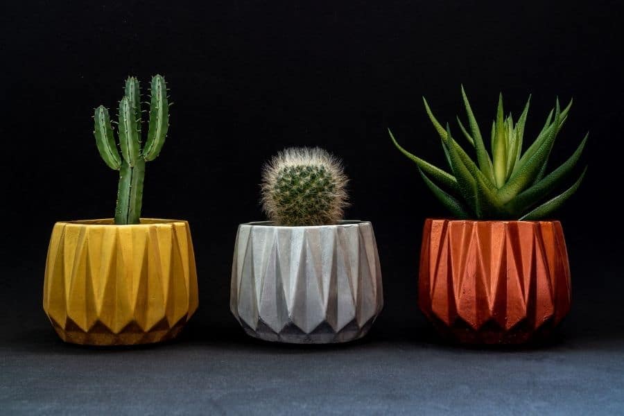
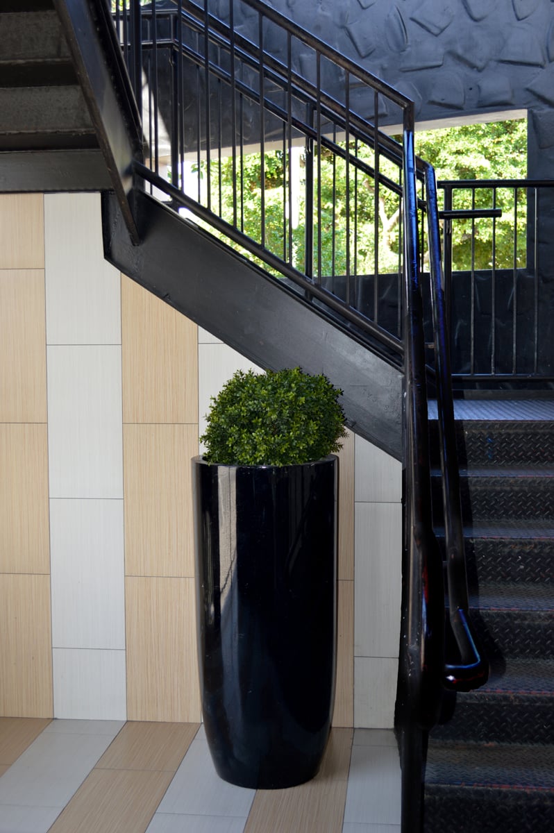
1. Black
Black is a focal point color. The depth of black will pull the eye towards it, much as a bright, bold yellow would. The difference is that the black planter gives off the sleek, modern appeal that many interior designers are leaning towards. Even in a room full of jewel or pastel tones, a touch of black will ground the room and add sophistication, in something as small as a planter! For more character, if it feels like using black in a plain planter shape is too ‘boring’, spice it up with a fun, geometric shape.
2. White
White is clean, crisp, and versatile. White accents are perfect in rooms where wall color and other decors already bring bright bold colors into the mix. White will balance these out, while at the same time standing out from the background and making itself seen. A white planter can also be used to draw attention towards focal points of the room, such as a large window, a beautiful fireplace or a quirky painting. While a sleek, white planter fits perfectly into any minimalist modern design, much like with a black planter, a fun shape adds a bit of character to make a splash.

3. Gray
Gray tends to be seen as an ‘industrial’ color – something that’s perfect for anyone looking to decorate in the ever-popular industrial theme. For those that may not want to go quite so far into the industrial territory, gray is still a wonderful decoration color for a variety of reasons! Gray is a neutral color in an entirely different way than white or black. Gray is a color that is used, normally, for cloaking. In rooms that are busy or in rooms that have too much going on, gray planters will detract from the busyness and make it feel calmer than it would without it.
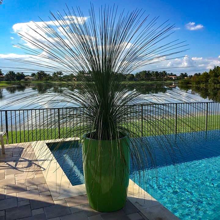
4. Green
While green is not neutral in terms of color, it is neutral when it comes to planter color. With plants matching the planter, green makes the decor feel more cohesive and flowing – the plant color flows into the planter, and vice versa. In rooms that may be less decorated and more laid back, having everything flow together and having a planter that doesn’t distract or draw attention, gives a very cohesive and gliding aesthetic.
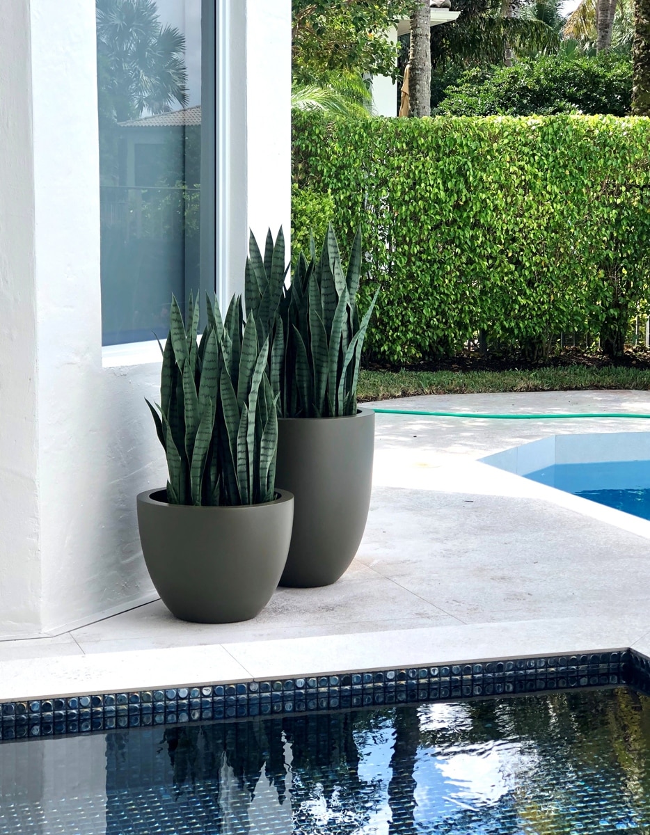
5. Brown
While brown is sometimes considered neutral, it’s neutral in an entirely different way. Brown is a wonderfully warm color, and it brings a sense of home into any room. For those looking to decorate their home in a way that makes it feel welcoming, brown planters are perfect for adding just the slightest touch of comfort. Brown colors also invite people to relax and unwind, making it the best color for areas like living rooms or bedrooms.

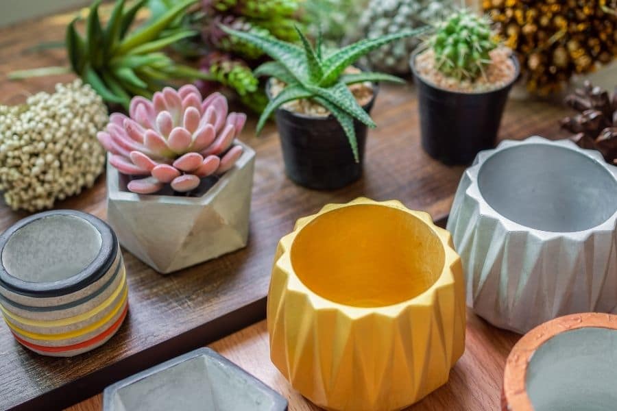
Best Color Combinations for Fiberglass Planters
The visual harmony in a design scheme depends largely on the tones and tints of the pure colors that we use in our spaces. Therefore, selecting commercial fiberglass planters in appropriate colors and finishes, like glossy, matte, or metallic, is an important aspect of your design.
Jay Scotts is all about quality and choice. When it comes to our planters, we know there is a lot of room for “wow” factor and brand colors. Because of that, we want to focus on some of our default color choices for our planters, so here are our recommended planter color combinations:
1. Satin Seafoam, Satin Green


2. Matte Bright White, Matte Black


3. Matte Cobalt, Satin Seafoam


4. Matte Cobalt, Satin Seafoam, Satin Green


5. Matte Black, Matte Charcoal


6. Matte Black, Matte Gunmetal


7. Gloss Tangerine, Gloss Saffron


8. Satin Beige, Matte Charcoal


9. Satin Beige, Matte Black


10. Satin Beige, Matte Cobalt


11. Gloss Red, Gloss Bright White


12. Satin Beige, Satin Seafoam


Picking a Color Scheme
Choosing the right color for your next interiorscape project can sometimes feel like a losing battle, especially when trying to balance everything perfectly. The best way to get you going is to determine what the room should feel like. With an idea of a warm-toned room versus a minimalist aesthetic, it is far easier to determine what other colors should be added into the room to guarantee that everything flows.
Here are the key things to keep in mind – four simple rules that can point you in the right direction:
1. Weight
While it may not seem like it, colors have weight! Darker shades of one color will make the room feel entirely different than the lighter shades of the same exact color. Bright colors draw attention to focus areas. They attract the eye to them, and therefore, attract attention to whatever is around them. Using brightly colored planters in an area you want to draw attention to is the perfect way to guarantee that it is noticed without being too obvious. If what you want to draw attention to is a quirky or standout wall color, choose black! Black emphasizes colors around it, allowing for that other color to really shine on its own.

2. Warmth
When warm colors are mentioned, most people think of fall. Crisp burnt oranges, dark reds, soothing Brunswick greens. These colors convey a sense of familiarity that makes any space immediately feel more homey and welcoming than other colors might. For an area that is designed to feel like home, look for these or other earth toned colors. Warm-toned rooms work best when there is a lot of natural light. For rooms that have less natural light, it is better to use warm tones as accents.

3. Minimalism
Minimalism is a trend that has increased in recent years. Whites and pastels make rooms look infinitely bigger, and in areas where rooms may be small or compact, it can be incredibly helpful to have them appear bigger than they are.
If having all white is too clinical and stark, using pastels as accents still gives the appearance of a bigger size while allowing for it to have a slight dash of color. Greys also work the minimalist design idea while still giving a sense of color to the room.
If you are into minimalism, here are the 7 minimalist interior design tips that you go by to give your interior that sparse, sleek, soothing look.

4. Balance
Balance is incredibly important. Too many bright colors can make the room look unprofessional, while too many dark colors can make the room feel drab and unwelcoming. In order to find a good balance, use accents as a middle ground. If there are busy colors in the room, neutral accessories and planters will make the room feel more pulled together.
Accessories such as planters can make or break the scheme of the room, so it’s important to remember the 60-30-10 rule. 60 percent of a room should be a dominant color. 30 percent of a room should be a secondary color. 10 percent should be an accent color!

Color Theory
One of the top design tips that business and homeowners need to know is color theory. This is a concept that revolves around the way colors interact with each other on the psyche, and it surrounds the fact that certain colors complement each other while other colors clash. Take a look the color wheel first.

The color wheel shows all the colors in the general color spectrum. Colors on the opposite side of the wheel will always contrast well, which is why you can see many promotional posters and materials using colors such as blue and orange, black and white, red and green. The number of combinations is virtually limitless here, but here’s how to understand the patterns presented above:
Complementary: It’s all about using four colors that are parallel to each other on the color wheel. These are simple colors that benefit well from each other.
Analogous: Contradictory to complementary, analogous are colors that are right next to each other, often in slightly altered shades. The famous poster of the Academy Award winning film Moonlight utilizes this by using Blue, Purple, and Violet.
Triadic: Triadic color schemes stem from tri-, meaning three. These are three equally complementing colors that all interact with each other and complement. Yellow, Red, and Blue or Green, Orange, and Purple.
Tetradic: Finally, tetradic or four complementing colors. These are a little more complex but can create breathtaking results. These are examples such as yellow, red, purple, and cyan. Where you begin splitting colors and finding their more nuanced form.
More Reading Matter
We do hope this is more than enough to get you started with your planter colors! If, however, you’re stuck in terms of choosing the best planter type for your next interior or exterior design project, then be sure to also take a look at 8 key factors to consider when choosing a fiberglass planter.
It’s also crucial to know how to actually add planters to your designs successfully, so just check out these unique tips on planter arrangement from professional designers!
If you want to see our planters in action, be sure to check this project out!

Claude Marquise – 301 Ocean, Santa Monica
The client wanted to add privacy to its rooftops, balconies and interior apartments by using the beauty of nature. Learn how our planters were perfect!
View ProjectIf you’re still wondering whether fiberglass is the most suitable planter material for you, then read our comparison of fiberglass with 6 other planter materials. And if you already own a fiberglass planter or a couple of them and would like to maximize their lifespan, then you may find it useful to browse the dos and don’ts of fiberglass planter maintenance.